Website Design, Website Development|7 minutes
Mistakes You’re Making On Your Homepage
Branding is more important now than ever, no one is denying that, but you can easily go over the top with your logo placement.

One of the real issues with web design is that anyone can build a website, but only a highly-skilled web design team can create something that really grows a business. There are very few barriers to entry, and that creates a problem. There’s a whole host of common mistakes you could be making with your homepage without even realising it.
Whilst many aspects of design are subjective and open to interpretation, there are still some notable tried and tested conventions you really ought to abide by. To bring you up to speed we’re going to highlight some of the common mistakes, and then introduce an approach that we use to create engaging and informative homepages.

Mistakes You Need to Know About
See if any of the following mistakes apply to your homepage, and then continue reading to hear how our approach to website design solves everything.
No one can tell what you actually do
This is probably the biggest mistake on the list because it means your homepage has completely missed the mark. It’s all well and good having an innovative concept style site, but what’s the use if your prospective customers can’t tell what you actually do?
You need to make things simple, clear, and to the point (more on how to do that later). Otherwise, all your homepage will do is confuse things and cause a large amount of traffic to click off somewhere else.
Your logo is far too prominent
Branding is more important now than ever, no one is denying that, but you can easily go over the top with your logo placement. Granted, it’s the embodiment of your brand, but if it’s all anyone can see on your homepage it’s just getting in the way.
Keep in mind that a lot of the people who are coming to you will not be familiar with what your brand stands for, so you’re going to need to give them an introduction. If you rely on your logo alone to do that, you’re not going to connect with a very big audience.
There’s zero social proof
In the era of paid reviews and fake news, it’s never been more important to provide genuine social proof. You don’t want it to dominate your homepage otherwise it will look too much like a long-form sales page, but you do need to show your audience what you’ve done in the past. This could be via verified reviews, a link to a case study, or any other way that emphasises your track record in a credible way.
You’ve confused customer service with your USP
Every business offers value, customer service, and a unique experience. There’s not a website out there that won’t claim to offer at least one of these, which means they’re not unique in any way.
You need to ensure that what you introduce as USPs are exactly that — they need to be something that your audience can’t get from anyone else. Customer service and value for money are things every customer expects, so focus your text on telling them things that will inform them and make their life better in some small way.
No one knows how to get in touch with you
You might think that it’s obvious how your customers should contact you, but you need to account for the fragmented attention of the average online user. If something isn’t readily apparent most people will return to Google and find somewhere else, rather than searching your site.
A small, unobtrusive banner at the bottom of the page is a commonplace to display contact details, which makes it an ideal option to consider. It’s often not necessary to do things markedly differently just for the sake of it. Stick to what people are used to and you’ll be giving them what they want and expect.
People don’t know what to do next
Your homepage is designed to introduce people to your brand, but what happens next? If it’s not clear to you then it certainly won’t be clear to your visitors. This is where your call to action comes in.
If you want people to do a specific task after they’ve finished navigating your page, you need to tell them what that is. A short and powerful phrase or instruction such as ‘Sign Up Now’ is all it takes. It’s a gentle nudge in the direction you want your visitors to go next that will make all the difference to your conversions. Without a clear call to action, you’ll be generating hardly any leads; no matter how nice your homepage looks.
Now that we’ve covered some of the common mistakes, let’s take a step back and consider what the homepage is really for.
What’s the Homepage Really For?
Is it the front cover of your website? A place to put your logo? Something you have because everyone else has one? If you’ve found yourself asking these questions after hearing about the common mistakes above, you’re certainly getting to the heart of the issue.
Your homepage isn’t there to fill the screen with flashing animations, videos, and logos. Instead, it’s designed to convey 4 simple pieces of information in a set order:
- What you do: Talk about what your business actually does
- What you’ve done: Show examples of your work
- What your customers think: Provides that all-important dose of social proof
- What you say: Branches out into other content, services, prices, etc
Alternatively, you could simplify it even further like this:
- Introduce yourself
- Establish a track record
- Gain the reader’s trust
- Offer to help them
Once you understand how to think about your home page, you’re ready to meet a webpage design methodology we use every single day.
Purposeful User Flows: The Proven Way to Fix Things
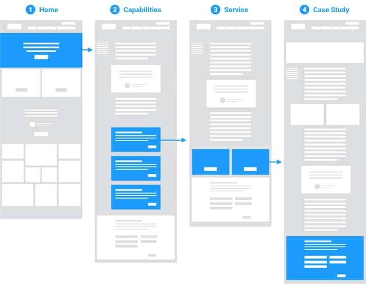
If you want to understand how a professional web design team approach things, you need to know all about purposeful user flows. They’re intentional flows of information with a well-defined direction that crucially do not involve your visitor having to jump back and forth to the navigation menu to find out everything they need to know. It’s a powerful and highly versatile approach that works for 3 very good reasons:
Reason 1: You can capture new, unfamiliar visitors who know nothing about your brand’s offering, and purposefully guide them through your funnel. Because it widens as they move through it, they’re introduced to a whole host of key pieces of information at exactly the right time.
Reason 2: It allows you to capture people who are actively researching and who may have found other content outside of the realm of your homepage. Once they click on your homepage to learn more, you can then direct them exactly the way you want.
Reason 3: You can include calls to action at multiple points along the funnel. That way if a visitor has already decided they want to move to the next stage, they can jump to it with the click of a button. Likewise, if you’re not fully sold, they’ll be redirected to another stage of your message.
It’s an approach your web design team will use to create a clearly structured homepage that guides your visitors in a way designed to optimise conversions and lead generation.

Sometimes Less is More
Last but not least, remember that sometimes less is more. This is as true with homepages as it is in any other area of life, but what would it look like in reality?
A number of brands opt for homepages with a single focus. By this, we mean that they contain just one key piece of information. It’s a powerful and engaging approach that can be highly effective at catching the eye. The key thing is to ensure that you express what you do in a clear, concise, and memorable way.
What Happens Next?
We’re always available to assist with home page design, so get in touch today so you can ask us any questions you may have, and have a team of web design experts create the centrepiece of your online presence.