23 November, 2021| Website Design|11 minutes
Is Your Website Easy To Navigate?
A report by HEAP found that 43% of consumers say websites aren’t easy to navigate, while a massive 95% of product teams say those same websites are easy enough to navigate and don’t need alteration.
This article will help you create a website that users find easy to navigate...

You ask your developer to build a website that will be easy for users to navigate, only when you go live, your audience says it’s not meeting their needs. You go back to your developer and say it needs to be more user-friendly with the users’ end goal in mind, they say, but it already is!
As frustrating as this experience is, it’s a pretty common one. There is a big gap between what product teams think users need and what the users actually feel about the site they are trying to negotiate.
A report by HEAP found that 43% of consumers say websites aren’t easy to navigate, while a massive 95% of product teams say those same websites are easy enough to navigate and don’t need alteration.
So what’s causing this gap and how do you overcome it to get what you want out of your website development?
After all, you’re paying good money for your website. When you factor in the time and the technical skills and the coding needed to meet your needs and invest in a money-making, lead-delivering site, it is well worth the price tag…if it fits your user’s needs.
That ‘if’ is what we’re discussing today. After that investment and time perfecting your business website, you want your audience to love it.
So what is happening that’s causing many website builders to miss what users actually need?
Online marketing is competitive so every brand is looking to build a digital experience that provides high engagement, ease of use and conversions.
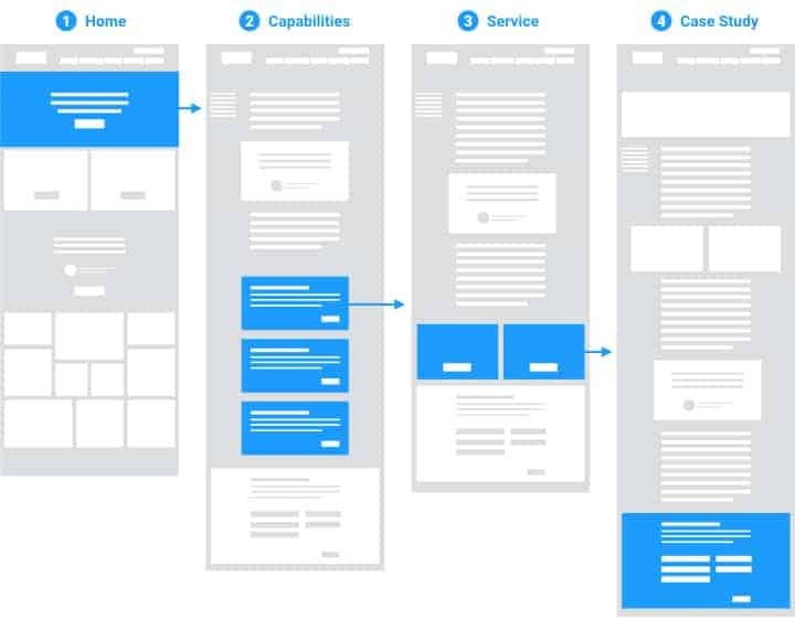
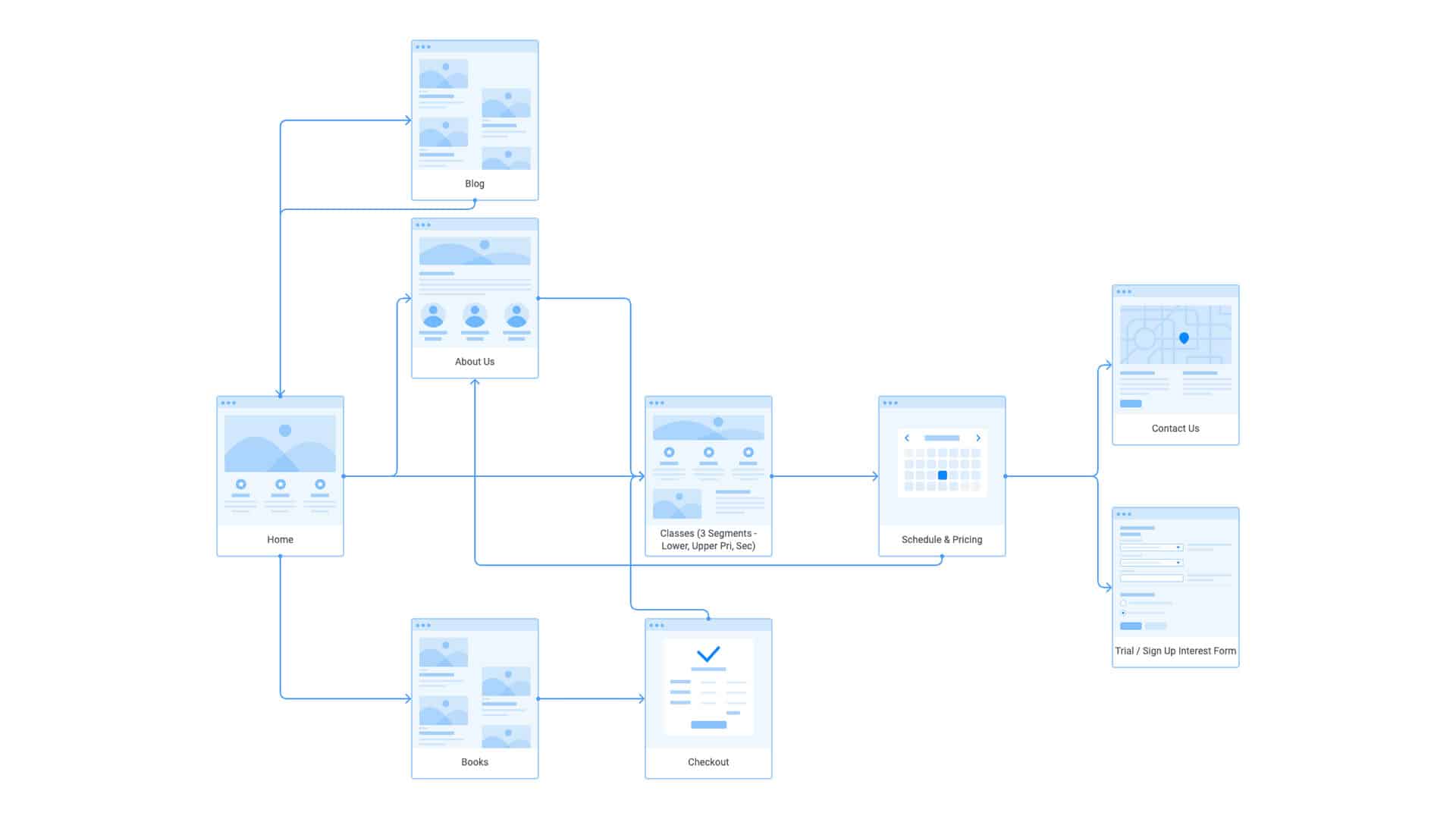
Imagine if you had a fraction of the story. Let’s say you had the, “Once upon a time” and an ending of “Happily ever after”. While it seems pretty satisfying at first glance it lacks any depth or even an understanding of what happened in between. That’s what’s missing in website building. Website developers are given the beginning and the end and create a site from that, but there isn’t a detailed enough understanding of what happens in the middle for them to fill out the path in between that works for what users are looking for.
We’ve discussed the user journey a lot through our blogs as a critical factor in creating engaging websites that anticipate what a user will do next and put those steps clearly in place for them to take easily.
If the product team or development team don’t know what steps a user will likely take, it becomes hit-and-miss on the effectiveness of the action steps they put in place.
As a business owner, you know your audience best. You know what their desires are when they look within your industry and to your business for solutions, you know their pain points and their hesitation. That makes you the best-placed person to create their map, or tell the full story so a users’ online journey can match their needs and expectations.
If you don’t know your buyer patterns it’s time to start mapping your data and monitoring your user activity to figure it out. There are plenty of online tools that can help. Even without a website in place, questioning tools like SurveyMonkey can get you some results on what your users are looking for and what steps they take to reach their end goal.
Once you have your customer journey mapped out, be sure to communicate that to your entire organisation. Everyone from your reception staff to product teams and sales can benefit from understanding what steps your users take so you can cater to their needs as a business.
We know that getting all that onto paper can be hard, knowing what to include about your business and products seems complicated, which is why we don’t just leave it up to you to figure out yourself. Here at Chillybin, we take the time to really get to know your business through our initial consultation and dedicated question time.
We fully understand that unless we have the entire story, we can’t know your user journey well enough to map it in code.
Your input and feedback are essential for creating a website that works for your users.
When you consider that 89% of consumers choose a website based on ease of use when given two similar website options, you can really see how critical website navigation is to get right.
When developers have the whole story, they can put themselves in the shoes of the user and lay the steps for their journey with accuracy and high engagement that will help make their experience a rewarding and positive one.

What Makes a Website Easy to Navigate?
We find that many of our customers asking for web development services are caught up in visual design and want something that will pop off the page. While that is an important aspect, something much more critical, and much harder to deliver is exceptional, customer-centred content.
So how do you give them what they need? We’ve got some points to help you out with how to plan a wowing website that is easy to navigate. When you deliver these directions to your website development team, you know they have the full story for what your customer needs are and can build your business website to satisfy your customers on their online journey.
Content placement
Because simple, straightforward navigation is an expectation high on the visitor request list you’ll need to find ways to deliver content to them quickly and easily.
Make sure everything you place is exactly where your users expect it to be, including navigation bars, menus and back buttons. Going deeper on that point make sure the options you choose for your navigation bars and menus contain the content your users need.
You need to be one step ahead of your customers to predict what they will need and put it right in front of them.
To get this right you will need to know what information they are looking to find, what questions they want to be answered, and which of your content is going to be a priority for them.
Make your website searchable
A comprehensive on-site search is a user favourite. It’s especially helpful for eCommerce websites that may contain a wide range of products. Visitors can use the search to quickly narrow down what they need without having to click through multiple menus.
You want to have your search option upfront, it’s a big plus for your site, so prioritise its placement and consider how you can draw attention using well-known markers, i.e a magnifying glass icon, as well as changing the colour of the text space or background colour to stand out.
Having placeholder text that is easy to overwrite can also be a welcome invite for users to click and search, common ones are “Search” and “Search Here”.
The most important aspect of an on-site search bar is that it works and works intelligently to bring back a relevant list of items that match what the user is searching for. Expect that your user will want to narrow down their search and give them options to do that to quickly and easily connect to the products they are looking for.
Have a clear and predictable navigation menu
When it comes to web design a lot of businesses want to make their menu selections unique in order to stand out from the rest. It’s not an effective approach as it leads to confusing messages and hard work for your users to figure out where they need to be going to. The standard titles are there because they are exactly what they say they are, “Contact Us”, “About Us” and “FAQs” work because they are safe and familiar to users.
When it comes to navigation menus, it pays to be predictable.
Steer clear of riddles and play on word titles and go for ones that are accurate, recognisable and straightforward.
Make sure your menus are just as clear and easy to access on mobile devices as well. That might mean you need to tighten the menu up to fit smaller screens or add hamburger menus to your mobile website version.
Make clickable content functions easy
If you want clickable functions you need to be obvious and clear about where they are. While having links blend in or be artistic might appeal to you more in terms of style and aesthetics, you’ll make your users hunt around or discover them accidentally, which isn’t adding value or improving your service to them.
With any hypertext, make them bold in a contrasting colour and underline them. Most links will do this automatically and for good reason, it’s what people expect.
You also need to consider making your clickables easy to press on mobile devices, which may have smaller panels, making clicks are easy to press, even on the go.
Contrast your sidebars
Just like invisible clicks, sidebars that become camouflaged with content is a common problem with visually heavy designs. To avoid this use a contrasting colour for the sidebar background or use white space to make it stand out from other page elements.
Increase action step opportunities
You can make your user journey fast and easy by offering more action steps. That might mean you offer more call to action buttons, or you can consider adding a footer with links if this is more to your audience needs.
Personally, I’d say to end each section (and possibly include in the middle) a Call To Action (CTA) which takes them directly to where they need to go next (primary TCA) or where they can go to read more info (secondary CTA). That way they have the link ready for them to take the next step without having to scroll back to the top to access your menu bar.
While most sites use buttons for their CTAs you don’t have to. There are benefits to both, buttons can add some colour and be visually appealing, however, they can also take extra time and expense to build, fall victim to bugs and take additional time to load. Anchor text linking to the next step can be just as visually appealing and will also help your SEO as it’s readable to computers.
Links can be especially helpful on mobile devices where loading times might be slower due to unreliable internet and buttons can move around and make navigation difficult. As well as annoying users, all these factors will negatively impact Google’s core vital checklist and affect your overall search rank so it’s worth considering links over buttons.
If you go with a footer make sure all your listed options are clear and accurate and come with a direct link. Your footer can either mirror the links you have in your navigation menu at the top of your page, or provide links to key website pages that might be far-reaching like newsletter sign up, targeted blogs, email or request forms.
Use big fonts and easy to read scripts
There is no point in having high-quality content if no one can read it. This is especially important for mobile device optimisation. Make sure your font is easy to read (no swirls, flourishes or narrow fonts please) and go for a font size of 12 or higher. Be careful not to go so large with your headings that they break over multiple lines. Always test your content for legibility on a smaller screen to see how it goes before you commit.
Provide a Sitemap
A site map covers anything you may have missed in your main menu and allows your visitors to jump to any section they need. A sitemap is more comprehensive than a menu bar, footer or sidebar and can open up easy channels for users looking for something specific that’s not immediately available.
Getting periodic audits done on your site clicks is recommended as it will let you know if there is any high traffic via your sitemap which will be better off being included on your menu or CTAs
As well as helping users jump to specific locations it will also assist search engines to crawl through and index the pages of your website.
Getting an effective, user-friendly website requires customer insights and an understanding of what steps they need to take next so that you can put that step right in front of them.
Our in-depth interview process makes sure that we have everything we need to create a website that your users will love.
If you’re ready to give your users a website experience that will turn them from traffic into leads, and leads into customers, contact us today.